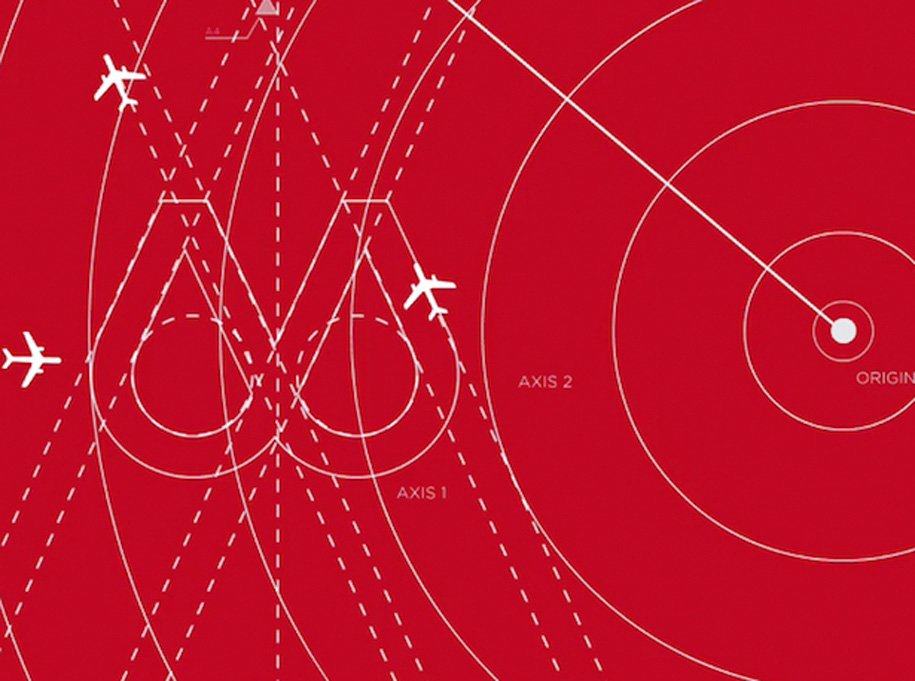
The Best Rebrand Ever: Virgin America Brand Update
Virgin America Brand Update: There have been far too many recent examples of such poorly designed, and executed rebrands.
It is with happy heart that Virgin America has really upped the game when it comes to brand redesigns.
I for one will be carefully watching how future brand redesigns use Virgin America as a benchmark for: quality and sheer creative professionalism, as well as the utter commitment required when taking on an epic responsibility of a logo redesign.
It's such a joy, and blessed relief, to finally witness a logo and brand identity redesign that really gets it.

Virgin America: "To achieve the look and feel, a team of 15 designers spent over 2,500 hours perfecting the precise shape of the circles. In fact, if you look closely, you’ll see that each circle is designed to mimic the nose of our Airbus A320 aircraft."
"From a series of eight simple dots that reflected eac… Read more →
